Yet, in the vast landscape of data science, we become surprisingly camera-shy. We possess an arsenal of tools to visualize our data, to see the stories within, and yet, we hesitate. Why? Because sometimes we choose to overthink things, making ourselves feel smart. We treat these tools like family portraits at holiday time, when they should be the candid photos of weekend outings.
Enter the enigmatic realm of Dimensionality Reduction, such as perceptual mapping, multidimensional scaling, and factor analysis. It sounds like a clandestine code whispered in the hallowed halls of a secret society, but fear not, for it is here to serve, not to confound.
Permit me an analogy. Imagine you are at the World Economic Forum in Davos, Switzerland, trying to organize a group photo. It would be like trying to arrange a family portrait where all the members are billionaires or Nobel Prize winners; good luck getting them to agree on anything, let alone stand where you want them.
Bill Gates is talking with Elon Musk; you want them close in the photo since they are both technology entrepreneurs. Nearby is George Soros—also a philanthropist like Gates but less similar to Musk. You try to position the shot so Gates and Soros align while Musk stands nearer to Gates than Soros.
Across the room is Jeff Bezos—billionaire entrepreneur but less focused on technology than Gates and Musk. You move to find an angle where Gates and Musk are positioned very close, with Bezos nearby but slightly apart, and Soros lined up with Gates at more distance from Musk and Bezos.
In effect, this creates a 2D clustering of distinct individuals by their main shared characteristics. The key connections converge in the frame and amplify each other by their proximity, just as dimensionality reduction does with data to create insightful maps—our lens onto the landscape.
Framing the Shot
A collection of data science tools under the umbrella term “dimensionality reduction” provides a way to generate these pictures based on data. Dimensionality Reduction sounds like something you’d do to your waistline after the holidays, but in data science, it’s a tad more complex and a great deal more useful.
Suppose you are in the automobile industry. You might have data on every major car brand, including physical characteristics of the brands (e.g., capacity, horsepower), consumer perceptions of the brand (e.g., stylish), and marketing (e.g., target audience, total media spend).
Or maybe you are in the consumer-packaged goods business and you’ve just finished a customer survey asking questions about perceptions of your product, such as quality, price, ease of use, and functionality.

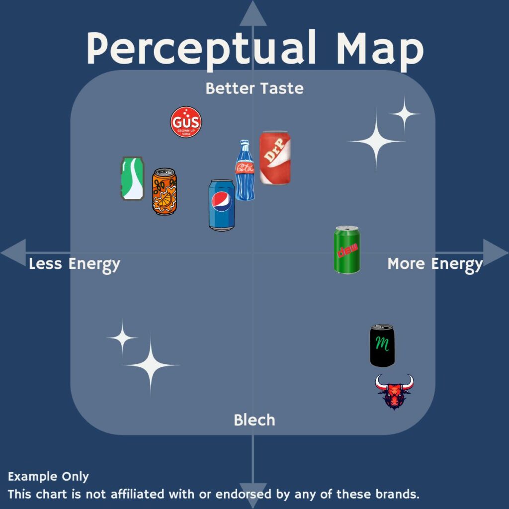
Data analysis could create a chart showing the relationships between the different car brands, each plotted somewhere on the X,Y plane. Or a similar chart that used the CPG survey to segment the customers based on two inferred characteristics combined from the survey questions, such as a value scale vs. a performance scale.
A clever use of these techniques can overlay two maps on top of one another. A movie studio might have data about a slate of movies and the potential audiences, use dimensionality reduction on each and create a single map that shows not only the relationship of movie vs. movie and audience segment vs. audience segment, but also positions the movies and audience segments relative to one another.
Filters and Lenses
Let us open our photo app and review the various filters of our data science toolkit. Brace yourselves, for here are the Daguerreotypes of data debauchery.
Multidimensional Scaling (MDS): Imagine measuring the difference between every pair of items—be it brands or customers—across a myriad of dimensions. Now picture these items plotted on a 2-dimensional chart, but maintaining an approximation of the real distances between them. Marketing wields MDS to hunt for “white space” and position your wares for competitive victory.
Perceptual Mapping: Like eavesdropping on the conversations at the Davos Summit. Imagine you’re there, ear to the ground, listening to the whispers of billionaires, Nobel laureates, and visionaries. Perceptual mapping takes the buzz, the vibes, and the zeitgeist then weaves it into a tapestry. Topics discussed become constellations and your photo subjects align accordingly.
Factor Analysis: Close your eyes and listen to Davos. The collection of cacophonous conversations is a kaleidoscope of capitalistic colloquy. Factor analysis distills them into key motifs. Think of it as summarizing a thousand soliloquies into a handful of powerful lines.
Other filters for our photographic endeavor carry jargony names worthy of NASA’s finest confusologist: principal components analysis, t-Distributed Stochastic Neighbor Embedding, Uniform Manifold Approximation and Projection, and Autoencoding.
Focus and Zoom
We can leverage existing data resources to explore new potential business opportunities.
Begin with a modest dataset, one that comfortably fits within a spreadsheet. Document the key attributes of your products and your competitors’ offerings to map the competitive landscape. Use this to shape strategies for updating pricing and products aimed at expanding into untapped market areas.
Tap into the raw data from latest customer surveys by transforming them into perceptual maps. This mapping forms the foundation of a plan to clearly differentiate your brand from even your closest competitor. Or venture into the esoteric domain of distribution partnerships, employing data enshrined within your annals regarding sales figures, equivalized volume, and territorial expanse. Fashion a positioning chart of the interplay between your conduits of distribution and the wider market. Forge alliances that augment rather than replicate.
Gallery Wall
Let not the labyrinthine depths of underlying data or the sorcery of mathematical incantations bewitch thee into excessive rumination upon the highest resolution of the charts! Pixel count is not our measure of success.
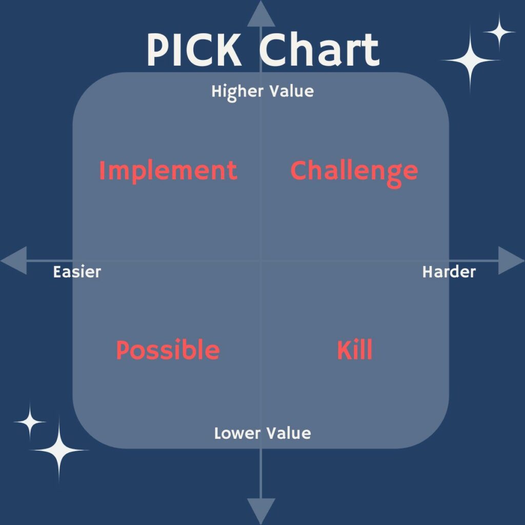
The objective lies in distilling complexity into simpler realms. We doubly bifurcate our chart’s canvas into four cardinal quadrants, each a beacon illuminating its own narrative. These serve as the arbiters between the wheat and the chaff, and, when wielded sagely, can steer decisions from international investments to whom to expel from one’s fantasy football team.
For project prioritization, I profess fealty to the PICK chart, whose axes gauge the exertion and the potential value of each proposed endeavor. Projects of lower exertion yet bounteous value reveal themselves with startling clarity, ascending the ladder of priority. PICK, an acronym, unveils the chambers of this chart’s sanctum:

And in my quest for personal efficacy, I invoke the matrix named for Dwight Eisenhower, Supreme Allied Commander. Each task, weighed upon the scales of importance versus urgency, finds its place within a quadrant’s embrace. The designation of each box proclaims whether the task merits immediate action, a rendezvous in the near future, delegation to another, or outright annihilation.
Witness, too, the well-known appraisals of the Gartner Group, who employ quadrant charts in their discernment of brands and products.
Overexposure
Exercise caution, for as with any implement, its employment demands circumspection. For some, contact lenses bring clarity, while others must wear bifocals upon the tips of their noses. Contact your data scientist if you begin to experience headaches or blurred vision.
While these cartographic marvels serve to distill complexity, do not be beguiled into neglecting the minutiae. Let these maps guide strategic ruminations, yet do not eschew scrutiny of the particulars before committing wholesale to the grand design.
Consider this analogy: Envision a globe, a radiant lightbulb held within. Envelop it within a cylinder of paper, capturing the contours of continents projected from the radiant core. Then unfurl the parchment and a map unfolds, a Mercator projection. Though a paragon of utility, one must concede its inherent distortions. Greenland is in truth much smaller than Africa. A flight from New York to Tokyo arcs, seemingly in denial of Euclid’s postulates, for the world is not flat.
Yet amidst these distortions, utility abides. Should you need to locate Paris, Texas vis-à-vis its more Francophone namesake, this map proves a stalwart companion indeed.
Should your perceptual odyssey unveil unexpected proximities between your brand and erstwhile strangers, perhaps therein lies a kernel of brilliance—or perchance, an oversight in the data’s embrace. Double-check where you double-down, for prudence yields wisdom where recklessness courts folly.
Shoot Now… Edit Later
Call in your data scientist and your head of market research. Talk to them about what data is already available and in a format that could quickly be put through “dimensionality reduction” to make a map. Let them sweat the details of the data and the exact mathematical approach.
Upon receipt of the cartographic display, scrutinize the landscape with your leadership team from marketing, product design, customer experience, and so on. Rethink your business. Hypothesize new insights.
But before you turn every spreadsheet and database table into an Ansel Adams masterpiece, remember: a picture is only as useful as the insights it provides. Otherwise, it’s just modern art. Task the data science and market research teams with validating your nascent insights. Whatever withstands the scrutiny, put into action.
Leave the math to the data scientists, but take the insights to the bank.
For more columns from Michael Bagalman’s Data Science for Decision Makers series, click here.
Contributor
-

Michael Bagalman brings a wealth of experience applying data science and analytics to solve complex business challenges. As VP of Business Intelligence and Data Science at STARZ, he leads a team leveraging data to inform decision-making across the organization. Bagalman has previously built and managed analytics teams at Sony Pictures, AT&T, Publicis, and Deutsch. He is passionate about translating cutting-edge techniques into tangible insights executives can act on. Bagalman holds degrees from Harvard and Princeton and teaches marketing analytics at the university level. Through his monthly column, he aims to demystify important data science concepts for leaders seeking to harness analytics to drive growth.
View all posts


